Friday 19 October 2012

Metropolitain Parc Du Carp, Cape Town, South Africa


Adding life externally to an un-used exterior of the entrance to a corporate company.
 
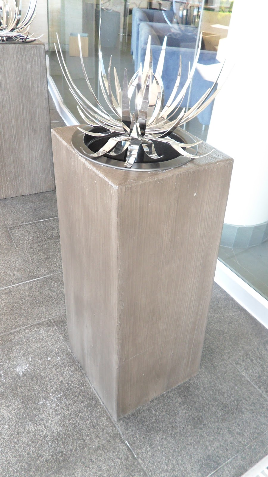
Based on coastal location and low maintenance of design and landscaping, I presented the idea of fully weathered materials. The slate stone finishes, rusted effect planters and xerophyte plants as well as fully polished metal aloes.
 
 
From a sun flared plan, the layout compliments the half curved building, this staggered and carried through all planters and seating benches. Tilt planters with a slate effect finish holds the high polished Aloes, this a simplified design of our home plants "The Aloe".
 
The benches of solid timber and ended off with brushed stainless steel, bring through the raw element of materials as carried through the rest of the exterior components.
 
The rust effect planters sit beside the benches hosting small local shrubbery, and along the perimeter larger rust planters hosting trees.
 
 
As on many sites, discussed changes appear for the better, the photos of the exterior show the blue LED lighting inserted on the vertical wall steps, which gives a cleaner and more presentable finish. Whereas on the renders they were illustrated horizontally.


Monday 23 April 2012

HOUSE ON THE HILL


Tuscan, tuscan, tuscan... Here in South Africa the Tuscan design and style of domestic architecture has infested the residential and more so estate living environments. A proposal done for a client, myself and some collegues played with natural lighting, introducing warmth to this bulk bricked structure.

The featured spiral staircase, your classical styled surrounded by glass, opens all three levels to a burst of light. The exterior consists of stone cladding and columns, all more emphases on the tuscan characteristics.


Friday 20 April 2012

CAMO KITCHEN


Screed floors, cool greys and brushed aluminium derailed by reconstituted veneer. Industrial, deconstructive refined through the 90 degree simplistic form of clean and straight.

A cold kitchen indeed, where warmth is to be created by the social and homely presence of its owner.

Given a clean area and tasked to create a kitchen, productive area, concludes to a design still left looking clean. Aimed at the client clean, sleek and simple, how much more can one strip the properties of material and introduce a living space raw to its lifestyle.

Monday 16 April 2012

THREE SISTER'S TAPA'S CAFE'


'Three Sisters', a project close to the heart, a goal and aim to accomplish. Name inspired by my mother Merle, and her two sisters, Rubina and Ingrid, The history relates to the stories told of my great grand mother, and how she spend most of her time baking for a Jewish family in a bakery.
She had left files of recipes of the best baked goodies, all warm and soulfully comforting which until today are being baked for the my family in our homes.

Introducing warm timbers and bulks, for a more comforting environment, this playing with the psychology of the mind creating a comfort zone when introducing food.
horizontal timbers stacked along the walls adds a feature, with lighting washed along the wall creating a warm glow.

Linear lines are kept into play along the wall and ceiling bulk heads, the use of timber is prominent.
custom lazer cut pendant hanging lamps designed by 'Lutfiya Peer', break the brown and whites.

Order and structure are crucial in most interiors, from seating layout to the kitchen processes into getting food on to the table are what makes a business successful. Keeping simple or formal, in the way one designs can predict the mindset of those they want to lure.


Tuesday 10 April 2012

Exhibition display - Gregor Jenkin


In essence designing an exhibition stand the first thought of mind is traffic, how does one control flow and create flow. Displaying local South African product designer Gregor Jenkins products we try to make it seem normal as if in use within its display area, creating comfort to the eye.

Access is introduced from all four corners, by walking in any direction we are able to view all products displayed. Raised on a low pedestal one can easily approach and interact with work displayed.

The concept of linear lines crossing at varied angles houses the products and more importantly the mindset of the viewer, by blocking off all external distractions. The red bold bulk heads and feature walls are mirrored on the floor pattern, in effect trying to create a opened cage, the kind of cage you want to be in.

Personally I portray exhibition design to be temporary rage of creativity, this a designer should not afraid to use open flare, a crazy taste to distract people from their surroundings and draw them into your world. This luring traffic and allowing the clients work to be a highlight. 

Wednesday 28 March 2012

"X" BEAM SEATING


X BEAM SEAT

Project done in 2009 during my third year of studies as a competition for Cecil Nurse furniture, the beam seat is based on your typical airport and waiting seating. The concept derived from the ergonomics of the human anatomy, the aim to host the human body by covering as little as 30% of the body.

The aim to be viewed as if only seated on the beam structure, in trying to accompany for both male and female. This the "X" shape plays an important part taken from simplified shape through the bone structure of the body used while seated.

The materials is what would bring upon the simplicity and comfort, creating a more high end look compared to the standard waiting area beam seating. This all metal elements such as arm rests as well the beam support to be chromed high polished, with piped upholstered white leather to introduce a ribbed cushioning.

Consisting of minimal components and fairly standardised workability has been taken into consideration for manufacturing and production of the X shaped Beam Seat.